Industry
Car Rental
Type
User Experience | App Redesign

App Interface Redesign
Avis App's Interface redesign to address UX challenges
The primary goal of this project was to enhance usability, streamline the booking process, and create a more intuitive interface for both new and returning customers. With the growing demand for convenient and accessible car rental services, this redesign aimed to position Avis as the go-to choice for modern, on-the-go consumers.
The primary goal of this project was to enhance usability, streamline the booking process, and create a more intuitive interface for both new and returning customers. With the growing demand for convenient and accessible car rental services, this redesign aimed to position Avis as the go-to choice for modern, on-the-go consumers.
Problem Statement
Problem Statement
Despite being a recognised brand, the Avis India app struggled with several UX/UI issues that hindered user satisfaction and retention. This was ultimately limiting the app's effectiveness in capturing and retaining customers.
Despite being a recognised brand, the Avis India app struggled with several UX/UI issues that hindered user satisfaction and retention.
This was ultimately limiting the app's effectiveness in capturing and retaining customers.

It was crucial to enhance the app to meet market demands. The data below indicated a clear growth in the customer base, but Avis's existing app was unable to capitalise on this opportunity.
Pain Points
Pain Points
Cluttered Navigation:
Cluttered Navigation:
Users often struggled to find essential features due to a lack of intuitive navigation paths.
Users often struggled to find essential features due to a lack of intuitive navigation paths.
Inconsistent Information:
Inconsistent Information:
The app presented information inconsistently across different sections, leading to confusion during the booking process.
The app presented information inconsistently across different sections, leading to confusion during the booking process.
Complex Booking Flow:
Complex Booking Flow:
The booking process involved too many steps, causing user frustration and a high drop-off rate.
The booking process involved too many steps, causing user frustration and a high drop-off rate.
Limited Mobile Optimisation:
Limited Mobile Optimisation:
The app was not fully optimised for mobile devices, leading to a subpar experience on smaller screens.
The app was not fully optimised for mobile devices, leading to a subpar experience on smaller screens.
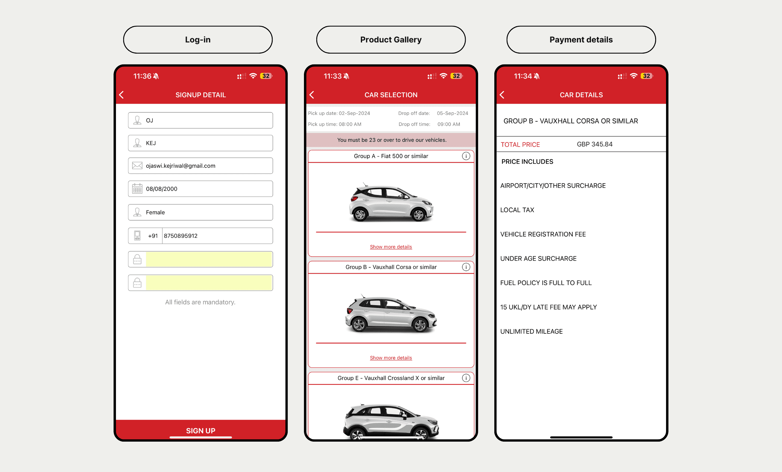
For Context, here are some examples from their old design…
For Context, here are some examples from their old design…


Solution
It was crucial to enhance the app to meet market demands. The data below indicated a clear growth in the customer base, but Avis's existing app was unable to capitalise on this opportunity.
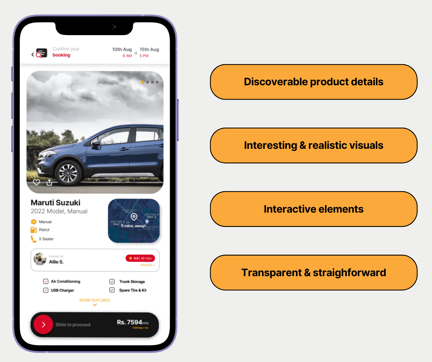
Highlights
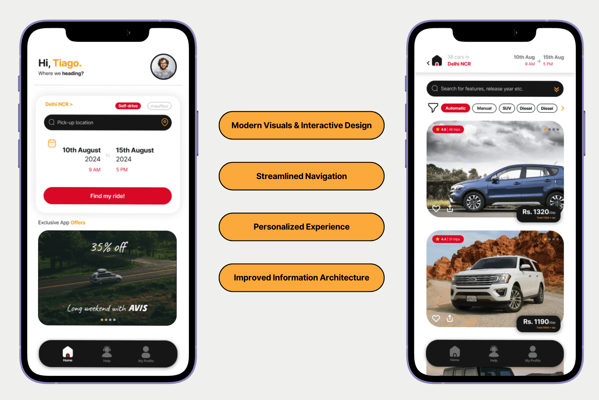
Restructured the Information Architecture:
Restructured the Information Architecture:
Simplified the app’s layout to ensure a more intuitive flow, reducing friction in the booking process.
Simplified the app’s layout to ensure a more intuitive flow, reducing friction in the booking process.
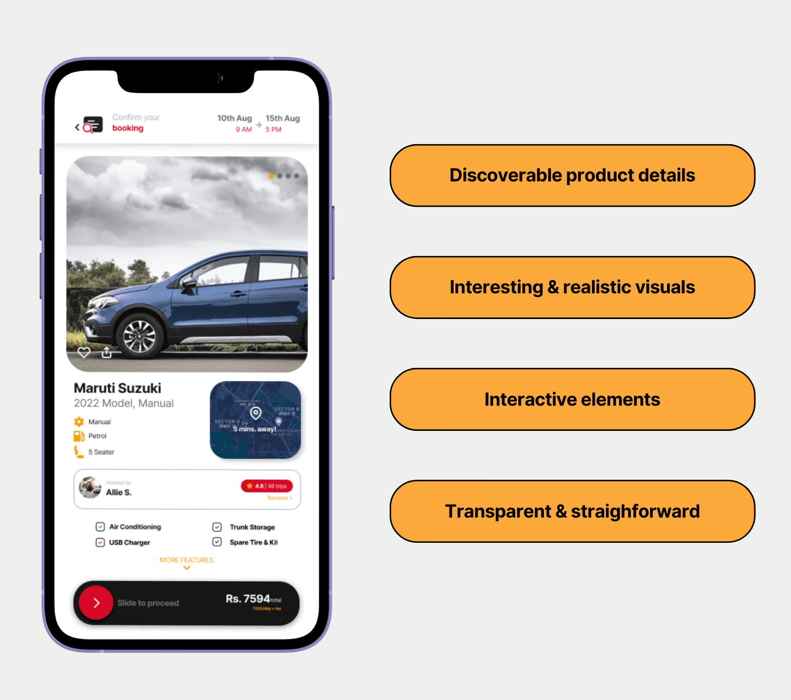
Eliminated Redundant Steps:
Eliminated Redundant Steps:
Removed unnecessary redirects and consolidated key features for a more seamless experience.
Removed unnecessary redirects and consolidated key features for a more seamless experience.
Designed for Clarity & Accessibility:
Designed for Clarity & Accessibility:
Created a visually cohesive interface with clear call-to-actions, ensuring that users could quickly find and complete their desired actions.
Created a visually cohesive interface with clear call-to-actions, ensuring that users could quickly find and complete their desired actions.
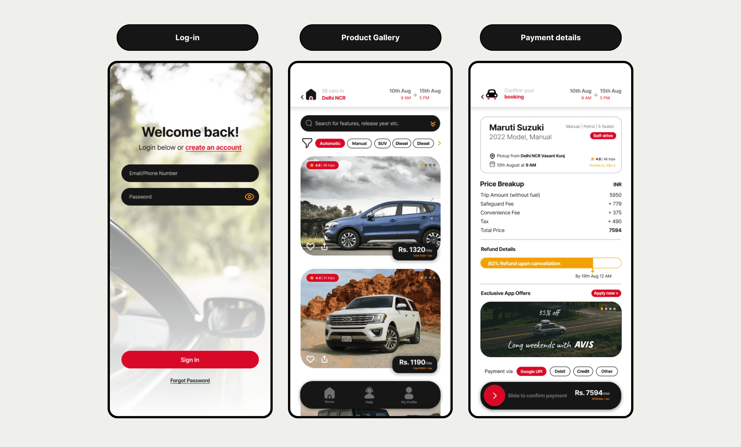
The redesign focused on creating a seamless, user-centered experience that simplifies the booking process, enhances information clarity, and optimises the app for mobile users. Here's a quick "before and "after"…
The redesign focused on creating a seamless, user-centered experience that simplifies the booking process, enhances information clarity, and optimises the app for mobile users. Here's a quick "before and "after"…
Solution


Results
Results
With these improvements, I anticipated measurable impact in key areas:
Increase Booking Conversions (15-20%)
Increase Booking Conversions (15-20%)
A more intuitive and efficient booking flow would reduce friction, making it easier for users to complete their reservations.
A more intuitive and efficient booking flow would reduce friction, making it easier for users to complete their reservations.
Improve Customer Retention (10-15%)
Improve Customer Retention (10-15%)
A smoother, more engaging experience would encourage repeat usage, fostering long-term loyalty. Features like personalised recommendations and streamlined rebooking options could further enhance retention.
A smoother, more engaging experience would encourage repeat usage, fostering long-term loyalty. Features like personalised recommendations and streamlined rebooking options could further enhance retention.
Reduce Drop-off Rates in the Booking Flow (25%)
Reduce Drop-off Rates in the Booking Flow (25%)
By eliminating unnecessary steps, reducing load times, and providing clearer navigation, users would be less likely to abandon their bookings midway. Improved form usability and progress indicators would also keep users engaged throughout the process.
By eliminating unnecessary steps, reducing load times, and providing clearer navigation, users would be less likely to abandon their bookings midway. Improved form usability and progress indicators would also keep users engaged throughout the process.
Reflections
Reflections
This project was a great exercise in rethinking user experience from the ground up. Without the constraints of a real client, I had the freedom to experiment and push the design in ways that felt truly impactful. The biggest challenge was refining the booking flow to make it feel effortless—something that sounds simple but required deep consideration of user behavior.
Through this process, I reinforced my ability to anticipate user needs, structure information effectively, and design for clarity. If implemented, this redesign has the potential to significantly enhance how users interact with Avis India, making car rentals smoother and more intuitive.